Contents
How to make it visible in the clutter Three stages to differentiate CTAs What do we recommend including in an animated video? CTA as a user's friend What makes CTA work? LIFT Model to craft the CTAs Conclusion16 min read
What do you feel when you see at the end of the article or on another site the words like “follow the link”, or “read and subscribe”? Many people say they at least feel an interest in the action. Other people say these words as a sign for them, a direction.
If they don’t see it, there are probably no other actions that can be done: you can close the link. This is how CTA works: it shows you that there are options, and you are free to take them of course, but I encourage you to do that. The encouraging part is extremely important. 
But let’s get a more in-depth analysis. A CTA (call to action) is a term used in marketing to name the act of encouraging viewers to take a certain step — contact a company, buy a product, and click on a specific link. CTA encompasses viewers at the end of a video, but sometimes it could have been done earlier. Wikipedia says this:
“Call to action (CTA) is a marketing term for any design to prompt an immediate response or encourage an immediate sale. A CTA most often refers to the use of words or phrases that can be incorporated into sales scripts, advertising messages, or web pages, which compel an audience to act in a specific way.”
And further:
“In marketing, a call to action (CTA) is an instruction to the audience designed to provoke an immediate response, usually using an imperative verb such as “call now”, “find out more” or “visit a store today“.
It is a quite straightforward thing: to ask people something to do precisely. But that’s what you have to offer to them. CTA is extremely important these days: it converts users into buyers or leads. There is no marketing without a call to action. Moreover, people work a lot to make it unique, cool, and simply attractive. 
How to make it visible in the clutter
When many things get standardized, people want a personalized approach to them. And it is not as if they just “want” it — due to an abundance of advertising it is to blind oneself from most of the white noise.
“You want to get those visitors to become leads, leads to become customers, and then customers to become promoters – but you can’t serve them the same CTAs to accomplish those different goals. Your solution? You’ve got to create multiple types of CTAs to serve these different audiences and their goals so that you can bring them down your marketing funnel.
However, you don’t need to go overboard and create a bazillion different CTAs — in reality, there are really only eight different types of CTAs you need on your website when you’re first starting out. As your business grows and your website gets more complex, you might need to switch these up, but these are a great jumping-off point for any marketer.” HubSpot
Understanding the importance of CTA, you’d be surprised how many businesses don’t include it in their videos. Is it just an omission or do they do that intentionally, hard to say? But they sure miss a very important step that may drastically affect the conversion rate of the whole video. According to researchers, a CTA in the video brings 380% more clicks than the one on the sidebar.
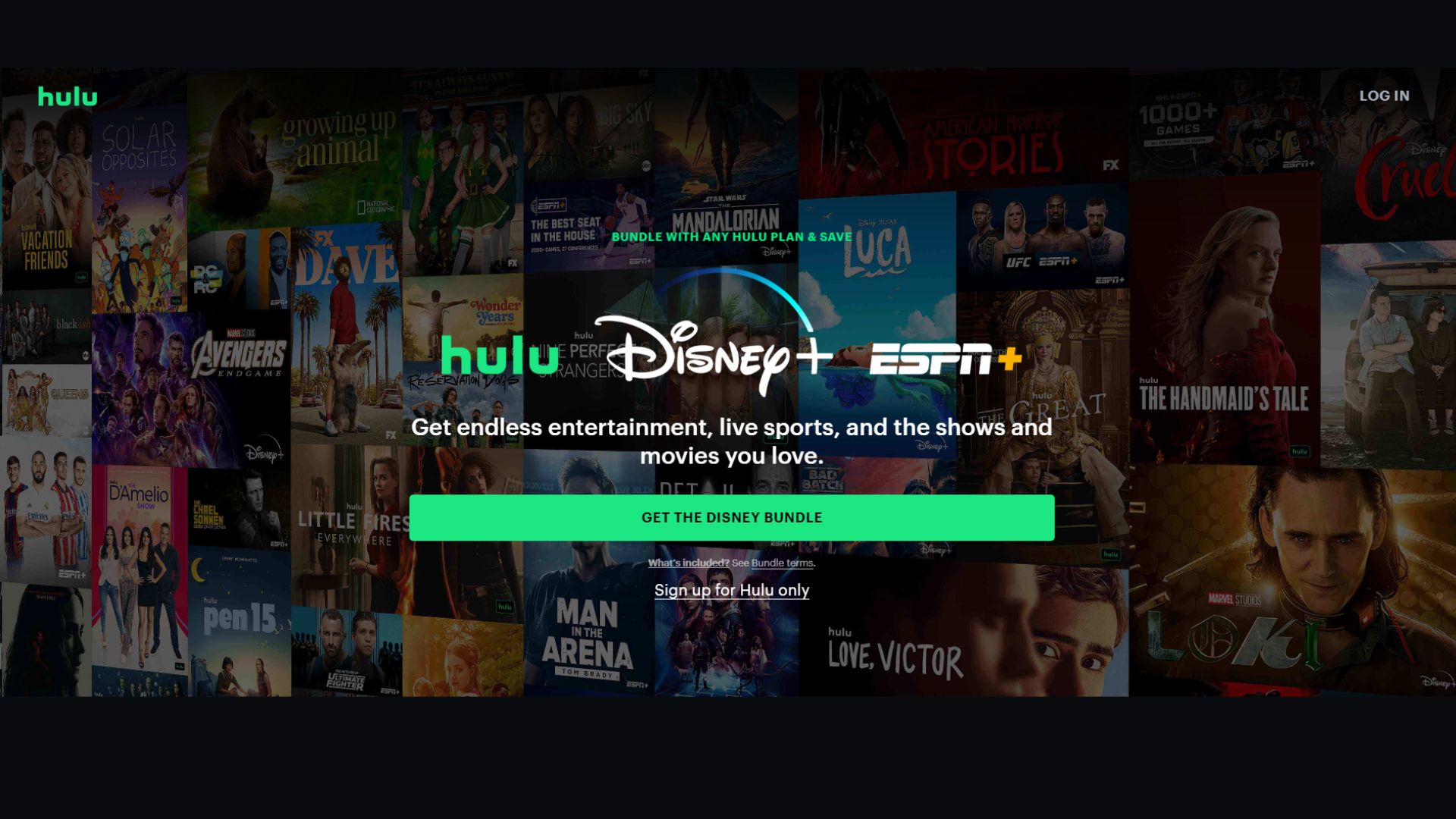
Another reason is that video itself is a powerful tool and a preferred type of content. So you have to finish it properly, with a clear call to action — people have to know your intentions, and what you offer to them. But the problem remains still: how to overcome visual blindness that we are all developing these years? Streaming giant Hulu nailed it with this CTA.
The background displays its offers, while the green and white text of the CTA gives you nothing but a clear choice: to pay attention to what they say. You just can’t miss that. It’s a sign-up and upsells in one: you, dear friend, can get a discount add-on with Disney+ and ESPN+.  Pretty good deal and a great way to draw attention, even though there is a massive visual trick. Remember that one. This is just one example, but it could easily be applied to your animated video where this trick is super easy to implement natively.
Three stages to differentiate CTAs
Not all CTAs should lead to selling. A lot depends on which stage you are on, and that will dictate what kind of the viewers’ steps will benefit you. Let’s look at them.
The stage of raising awareness. The goal of your video is as straight as possible: to generate awareness of your product or services. Usually, it is a video that just shows what you have done during the years, what you achieved, and what is your company about.
The CTAs must direct your viewers on soft goals: explore more of your content, product offerings, services or ideas. It is really an offer, a tap on the shoulder with the words “hey, we have some good stuff, why don’t you..you know, check it out?” There might be links to other pieces of content, newsletter subscription forms, your blog, or anything you want to raise awareness of.
The stage of consideration. Videos on the stage are getting hotter. You don’t have to be soft, you can try to teach people something with your cool how-to videos and webinars. This is where you actually share your experience. And that’s a great part of the funnel. Of course, here you can give your leads some room to identify themselves. Create a more complex CTA that would lead to even more immersion in your product.
The deciding stage. Burn, huh? This is where the heat is at maximum. No more soft CTA — here your CTA should create buyers and invest in Loyal customers. CTA may allow users to book a consultation, pricing, or whatever step you want them to take at the final stage of the simple funnel. Yes, that was the funnel, you got it right.
“If a viewer is watching your video on YouTube, the ask is simple—include a customized link to a landing page on your website that is dedicated to getting that viewer the supplemental information they’re looking for and, consequently, into your sales process.
The main goal of YouTube is to get the viewer to your website. There are way too many shiny things and cat videos to distract audiences on YouTube, so get them to your playground where you control the experience and the flow of content they consume.”
Eric Guerin, the Founder and Executive Producer at Adelie Studios.
What do we recommend including in an animated video?
Animated video is different in the means of information from a site or an article. People perceive it differently, and the outcome could be different, too. A lot here depends on your voice-over artist, on his or her ability to display the right tone.
If the page words just like “click on the link” can work for its neutrality, in the video, it might be too boring – the viewers might not even notice it. If you want to redirect your viewers to the other link, where they will take an action, you have to describe it as a position. Redirection is hard due to the fact that many of us can just forget about it.
“Once you get your audience to your website, or if they came to your website, to begin with, great! They have already expressed interest in what you do! Please don’t blow a perfectly good opportunity by telling them at the end of your video to “visit your website for more information.”
That is a waste of a potential next step you could ask them to take. They’re already on your website; give them the next step, don’t make them go find it on your website.”
Eric Guerin, the Founder and Executive Producer at Adelie Studios.
In any case, with such a great tool as animation, we strongly recommend using both verbal and visual CTAs. Why? Because people perceive things better when the visual and verbal are crisscrossed. Telling your viewers what their next step should be is telling a direction, but a visual approach will show them where they go. Besides, a well-animated clip will inspire them. Believe us! Adding clickable elements to your video is common practice, you can do that literally everywhere.
If you ask us to create you a video with CTA, we can add that link. Or a lot of them. We love short, straightforward CTAs. But we say you should put more effort into creating it. What does it mean? There are tons of short, but typical CTAs. This is another way to go blind, and don’t notice these calls to action. That’s normal, right? But in order to make your message more unique, try another approach. The one that makes your content writers polish the phrase.
yt_iframe
CTA as a user’s friend
You see, we’re not fans of aggressive types of calls to action. There are people that see aggressive encouragement as a way to – no, as a proper way – make people act. We’re not advising this at all. A strong call to action doesn’t have to be aggressive. HubSpot has wonderful lines about CTA as a friend in relation to their popular CTA button. We are very much on the same page.
Take a look:
“Have you ever added a button to multiple pages, and then changed your mind about the wording and wanted a quick way to update all of the buttons on all of the pages? Yes? Then CTAs are your friend. What about an email sequence? Have you ever added a closing button on a whole series of emails and wished you could change the wording on all of them? Yes? Then CTAs are your friend.
Have you ever wanted to test two versions of a button to see which works better? Yes? Then CTAs are your friend. What about having the button show something different to a customer than it does to a prospect? Yes? Then CTAs are your friend. Have you ever wanted to get a report that shows how many times your button showed, and how many times it was clicked, and on which pages or emails? Yes? Then CTAs are your friend.”
We would say that CTA should be your friend — the one that directs you to a better outcome, showing new positions and options. 
What makes CTA work?
- Compelling phrasing: short, clear and precise words can make people perfectly feel what you have to offer. On the surface, your CTA has to sound like the best version of itself.
- Inclusive offer: remember how we tell you that people tend to be blind to many, not personalized things. If your offer is inclusive — anyone will see it.
- CTA that redirects to a goal: it is a great offer if a viewer can just click and to that place you encourage them to go.
- One way: CTAs that offer one option for a user to explore often win him. Why? A singular option is a great thing because it’s the only and probably the best offer there. The more options people have, the more they feel confused, according to a famous experiment. Make sense.
- Price promise: a very strong trigger to actually consider taking the action. Especially if you manage to say something about the price more than once. But not in the same CTA: prepare users for it.
- Image: good old powerful visual attractor. Branding, colors, and just a good image is a winner. Always.
- Simplicity: a few words can be a winner, but according to our first point, they also have to be really creative. That’s super important.
- Pain points: It does not always have to be in CTA, but it is a recipe that works. Almost like personalization, because it addresses someone’s problem.
LIFT Model to craft the CTAs
Venture Harbour founder Marcus Taylor increased his conversion rate from 2.5% to 10.8% through very subtle and yet plain changes. He put as a pillar the LIFT model — the concept indicates six factors that help convert viewers.
- Value proposition: the benefits must outweigh any perceived costs.
- Relevance: Your content has to relate to your audience’s needs and wants.
- Clarity: Your CTAs need to be clear and understandable. If it is vague, irrelevant, or you have chosen improper words, people will be rather confused.
- Urgency: you have to be immediate, by simply granting an immediate response to the action.
- Anxiety: no one will take action if you fail to build trust. Show proofs. Make them believe you. Or in your product.
- Distraction: Make sure there’s nothing on the page that distracts from your CTA, including asking the user too much.
Conclusion
Your video content should always have a call-to-action. Without it, a video is just another video that can be good, bad, or exciting, but it doesn’t encourage you to do something. Every great speech in history, whether it was for good or mean aims, was always accompanied by a strong and clear call-to-action. We’re not asking you to be like these orators, no. Just make your video work. Inspire action among the video viewers. Make sure that every video – no matter if it is animated or not – contains a CTA. Give your content writers time to come up with something catchy.
Feel free to try the approaches to CTA we shared, and if you still don’t find “that phrase” — hey, we are here to help. Always ready to create a great animated video for you with a compelling CTA. Blink-blink:)


